Adaptive website design is a convenient system for displaying the same website on different types of devices online. In simple terms, this is the ability to view one web page on a laptop, smartphone and other gadgets.
Web responsiveness has become a necessity ever since people got internet-enabled gadgets of various formats. Companies, online stores, and even just informative sites strive to please their audience, adapting to it in every possible way. Responsive design solves the problem of convenience, therefore it is an indispensable work item.
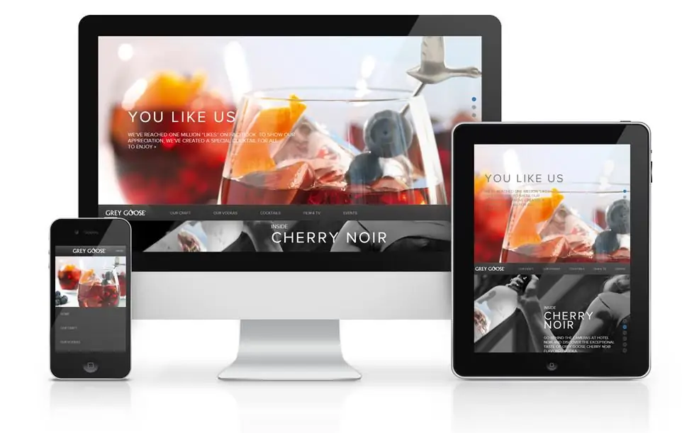
Characteristics of Responsive Web Design
The convenience of design is characterized by several main criteria.
- Size. Responsive website design should have minor differences when displaying the page on different devices, so the sizes of images, text and other elements viewed should correspond to the sizes of the devices themselves. To do this, web developers adapt the design so that it has multiple views.
- Content adaptation. Material that fills the site (images, videosand other multimedia elements) must also match the required screen resolutions without losing the quality of the display.
- Design flexibility. Inclusion in the development of elements that allow you to quickly adjust the design of the site when you change the web page you are viewing. For example, the user scrolls the page up and down, navigates through different sections, or changes the screen position from vertical to horizontal and vice versa.
- Simplify items by device for better usability.
- Hide unimportant blocks on smaller screens.
Basics
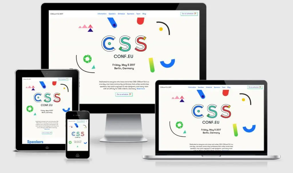
Website building is definitely related to programming languages, because you simply cannot do without them. Using HTML and CSS, the browser recognizes the composition and order of objects (texts, illustrations, videos) - this is how the site is formed.
CSS is responsible for color, styles, sizes, fonts, alignments, padding, background elements, forms, etc. HTML is responsible for the overall content and structure of the site. Thus, a web resource is built in the aggregate of the two most important description methods.
CSS, on the other hand, is an indispensable design tool. Has a large set of features that are superior to HTML:
- Provides design consistency across multiple pages, site appearance, and controls the display of HTML documents.
- Gives you the opportunity to do design and content at the same time.
- Applies multiple styles and the ability toviewing on different devices.
- Makes complex design decisions.
- Characterized by high speed.
To develop a website, you need to know some basic concepts.
A CSS selector is denoted by the name of a style that defines properties and formatting options. It tells the browser which specific element the properties apply to.
A property is a structural unit. It defines external parameters (size, location, color, shape, etc.) and is expressed in a specific code.
There is a set of defined CSS properties that describe a single object in appearance and location.
Together, these elements form the following scheme:
Selector { property1: value; property2; value }.
Layout sizes and resolutions
Design development begins with the preparation of the layout in Photoshop or other graphic programs. For convenience, special markings of the modular grid are introduced into the canvas, special indents are observed. Thus, the web designer shows the layout designer the principles of structuring the future site and the correct arrangement of web elements.
Responsive web design resolutions and sizes for main device types:
- This design adheres to the principle of starting work with mobile permission. The layout for the smartphone is created in the size of 460 × 960 px.
- Tablet layout size is 768 × 1024.
- Notebook size is 1280 × 802.
- PC size is 1600 × 992.
In the mobile version of the siteshould be as simplified as possible, while retaining all the main functions. If the layout is being prepared for an online store, with all the simplification in use, it should have a main description, a product catalog, an order option, a shopping cart, etc. - all the necessary elements for full-fledged functioning, as with full-format viewing on a PC. The convenience of the mobile version is that here you can avoid extra pages to save time when loading.
In adaptive content, using html code, you can hide some elements that are not really needed. For example, at high resolution, the site displays a product card with its description, price, delivery information and the ability to add to the "Basket". In mobile resolution, the process is simplified to a photo, a price, and a buy button.
Medium and minimum resolutions for responsive design should take into account the ease of reading and viewing by the user.
Layout
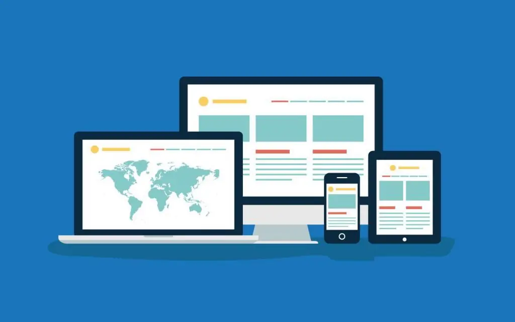
The purpose of adaptive design layout is to create a flexible layout, or as it is also customary to say: "rubber template". The bottom line is not in single-digit page sizes, but in the proportional compressibility of the template for easy viewing on all devices.
It is built mainly on CSS. During development, control points of screen dimensions are determined. Thus, the width of the remaining objects is determined. To do this, the width of the page is set by the css max-width property, depending on these criteria, the size of other elements is selected as a percentage. For example, the block size on the mainpage is 600px, and the width of the sidebar block (site sidebar) is 400px, respectively, the content width will be 60%, and the sidebar width 40%.
There are several types of responsive layouts. Each is selected individually, depending on the features and construction.
Views:
- A layout type that allows blocks to wrap when screen resolution is reduced. On multi-column sites, additional blocks are moved to the bottom of the screen.
- When a separate pattern is worked out for each permission. This type of responsive design takes longer but is the most readable.
- A simple type of design that aims to scale all elements. It's not flexible.
- The panel type is convenient for use in mobile applications, when additional functions appear when changing the position of the screen itself.
Creating responsive layers is only one part of the job. Adaptive images are a separate case, which has its own problems and methods for solving them.
Single image must be clearly displayed at different screen resolutions. There is a problem here - how to make sure that the picture always remains the same, regardless of the change in resolution. Entering a simple CSS code in this case will not be enough.
Example: img {max-width: 250px;} - here you should apply a method in which the size of the container containing the image is limited, and not the image itself. It will look something like this: div img {max-width: 250px;}. This method solves the problemlayout of small images, but not suitable for large illustrations.
Therefore, many developers prefer to use javascript languages that allow you to adapt any image without overloading the server. Javascript offers a large number of alternative scripts.
Pros and cons of responsive layout
Positives:
- Save the location of all elements. This is convenient when the user is used to the full version of the site.
- Save domains and addresses.
- Full customization for other permission formats.
Negatives:
- Functional flexibility is lost
- Any informative overloads are fraught with a long launch of a web resource, which forces many users to switch to faster options.
Creating a website
The site structure is divided into several sections and blocks. Traditionally, the layout consists of the top part of the site (header), logo, menu, content block and the final part of the site (for example, detailed contact information). Let's see how to make a responsive website design from a simple template.

Auxiliary tags for writing:
- wrapper - tag that combines all template elements;
- header h1 - logo;
- header - header for menu and other important elements;
- content - block;
- colLeft - content size;
- colRight - sidebar (side column);
- footer - the final part of the site;
- media screen - setsdesired resolution.
When writing a site, these elements can move in a different order, depending on the need. For example, at high resolutions, the menu may be displayed vertically. In the mobile version, the layout can be built in such a way that the menu will slide out in a horizontal position.
- viewport - a tag that allows you to save the size of the text in a smaller version of the design. It is located between the tags.
- max-width - to optimize the site to avoid stretching at resolutions over 1000 pixels.
When implementing the layout, the jQuery library helps a lot when you need to change the style and structure of the blocks.
What is the difference between responsive and mobile design

For a complete understanding, consider a few illustrative examples, as confusion between these two concepts is not uncommon.
You need to understand that the mobile version is an analogue of the primary site with a subdomain. The external presentation of the site completely repeats the style and functionality, while its structure and content may differ from the main version, since the version is cut down to the necessary elements.
Responsive design is optimal for all device resolutions. It is scalable and renders correctly regardless of viewing conditions.
These are two different presentations of the site, around which disputes tirelessly rage which one is better. It should be noted that no definite decision has yet been reached. Someone praises this design, pointing out the fashion trend and a lot of advantages. The mobile version also has several advantages that responsive design does not have. Therefore, to begin with, you should understand the basic needs.
Benefits
How is responsive design better than mobile?
Versatility. In our time, with such a frenzied growth of the market, it is simply necessary to present information in a different way, satisfying the wishes of consumers. Responsive design solves this problem.
Effective promotion in search engines. What can not be attributed to the main advantages of an adaptive device. Search engines prefer to give users responsive websites.
Usability. Responsive design is usually designed in the best design solutions, which is a nice present for the visual perception of users.
Ease and simplicity both in the implementation of the project and in its use.
Good conversion rates. Since with adaptive design there are more opportunities for display, the conversion itself increases.
Economy. It is relatively cheaper than creating and promoting a separate mobile version.
Pros and cons of the mobile version
Creating a responsive mobile design requires versatility and consistency. First of all, it is recommended to write out the terms of reference in detail, which, of course, will help to avoid unnecessary work and save time, as well as take into account the features of the server on which the site will be hosted.
There are certain advantages and disadvantages to mobile responsive design.
Pros:
- If you have a ready-made site, there is no need to develop a design for the mobile version from scratch. Only a few changes can be made, freeing this layout from unrequired functionality.
- Due to all kinds of simplifications, the mobile version is considered faster when downloading.
- The user sees the most important piece of information in all content.
- Fast implementation. There are plugins with which you can implement mobile adaptation, even if you do not know tags and codes.
- Search engine choices favor adaptive versions because they take less time to analyze.

Cons:
- Not all mobile versions may match mobile device resolutions. The site, of course, will open, but the screen resolution does not always match the layout. Sometimes a well-designed smartphone design may look different when opened as a tablet.
- Mobile versions require separate paid domains.
- There are some minor issues with posting content. If there are several versions at once, the content should be adjusted for all formats at once. Submitting new material on the main site and copying it to the mobile version can be considered stealing. To avoid this problem, you may have to prove the connection of resources.
Methods of implementation
Main implementation methods:
- After creating the design of layouts and layout, it is loaded to the required dimensions usingoperator site and main code. This is a classic method used when creating medium and small versions (tablets, smartphones, etc.).
- BootStrap is a simple and clear set of adaptation tools. Suitable for creating versions for Landing Page and other not very complex web projects. It gives a good opportunity to apply many different styles in interface functions.
- Responsive Grid System is a popular set of versatile tools. Easy to apply and does not require deep knowledge. Includes a wide variety of infographics.
- GUMBY - A CSS framework boasting flexible responsiveness and great tooling.
- Cookies - allows you to implement responsive images. Automatically accompanies files requested by the browser.
- ExpressionEngine is another way to create responsive images. Determines if the device is mobile, capable of changing images to the required resolution.
- ProtoFluid - Provides rapid prototyping. Suitable for all kinds of devices.


