In the vast world of information, a person more often remembers the images and emotions that are associated with it. That is why the visual component is considered one of the main driving forces of any product. Such a visual image forms an opinion about the product and the manufacturer, competent advertising is able to change the mood of the audience and associate it with the concept of the brand. That is why an advertising solution, before seeing the light in all its glory, goes through a long way of birth, implementation and refinement. At the development stage and before the final implementation, the obligatory stage is the creation of a design layout.
Definition
Design layout is a schematic representation of the final idea with all the details. It indicates the concept, fonts, texts, images, the location of all elements and the overall picture of the product.
At first glance, it may seem that the process of creating such a tool is simple, but the design layout is a huge painstaking work of various specialists, the processthe creation of which requires a colossal effort of creative abilities and strengths of performers.
Features
Design layout is a map that the customer must read and understand, and after him a large audience of consumers of a particular product or service should understand the essence. In order to be adequately perceived by the audience, the layout must meet the following requirements:
- clarity;
- readability;
- harmonious composition;
- interests of the customer, his key idea;
- have the required specifications.
Design layout is the practical implementation of a creative idea. Based on this fact, there is no restriction on the use of elements if they comply with the concept and external rules. The rules in this case include legislation, technical capabilities and other factors that the designer cannot influence.
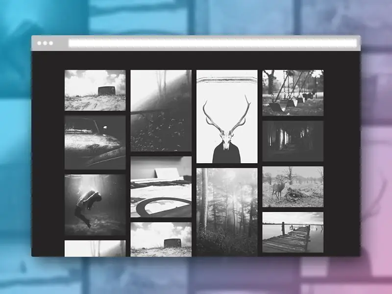
The integrity of the design layout is created using the following tools:
- lines and shapes;
- color and tone;
- texture;
- size;
- perspective.
These elements create a design to implement the idea. When creating a design layout, the following principles must be observed:
- proportionality;
- balance design;
- clear accents;
- integrity and unity of elements.
Views
Based on purpose, layouts are divided into architectural and advertising.
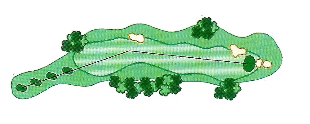
The first kind isa scaled-down version of an architectural and landscape structure to display an object. As a rule, small details are finalized schematically, focusing on the main line.
Promotional design layouts within their group can be divided into print layouts, online products, press layouts.
For the press
When developing a design layout for the press (images and articles in printed publications), it is necessary to take into account the features of this type of media structure. For maximum effect, the following factors should be taken into account:
- number and frequency of exits;
- publication format;
- size of a possible placement block, its location.
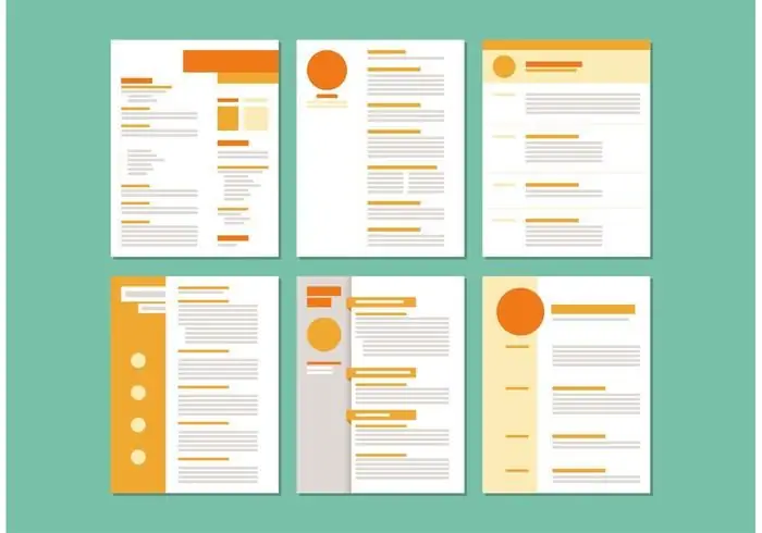
It is possible to make a design layout harmonious only with the correct placement on the page of the publication of the entire array of text, illustrations, headings, notes and notes. To achieve this effect, the specialist moves from the general idea to the implementation of particular details, thus maintaining the unity of the design and observing the key task of the presented amount of information.
Site layout
Making a design layout for a website is fundamentally different from the usual typographic craft. In this case, the project is the appearance of the entire web document, indicating each button, labels, links, text, pictures, etc.
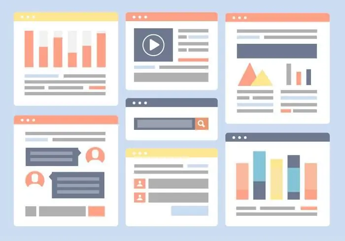
To quickly make changes to such a layout, designers are recommended to perform each of its elements ona separate layer in specialized programs so that if necessary it can be hidden or changed in the shortest possible time.
When demonstrating the results of work, it is important to show the site on an appropriate scale in order to eliminate the moment of misunderstanding in relations with the customer. To do this, use programs available by search and recommended by professional designers on forums and specialized resources.
Printing
When making a layout for printed products, the arrangement of elements relative to each other is considered to be a particularly important point. Subconsciously, a person reads any information from left to right, including visual.
Contact with such an advertisement rarely lasts more than two seconds, so in this short time it is necessary to achieve the desired effect - to catch attention and convey the main idea, emotion.
Taking into account the peculiarities of perception, the layout is built from left to right while maintaining proportion and harmony. First, a person reads large and dark blocks, then perceives light colors. Such a game with tones and size allows you to focus on the main idea, forming the correct perception of the concept of the advertising message.
Text in the layout can be primary and secondary, the separation is done using size and color. Large-sized information on a dark or bright background is read first. Text blocks are separated from each other by empty fields, diluted with pictures, because a layout overloaded with text is hard to perceive and creates the impression of a complex product.
So the design-layout is used in every industry where a creative idea is translated into reality. In order to take into account all the nuances, without missing a single detail, they use such a layout, where it is clearly visible what the embodied idea will be.
The layout helps prevent unnecessary financial costs for the manufacture of the product and its further alteration. At the same time, the layout helps creative inspirers communicate the concept to the management team and clients, whose imaginative thinking cannot create an image of the described project in their minds.
Design layout has firmly entered the life of designers of all directions, because without a draft there is no high-quality finishing work. Almost every creative direction agency offers to develop a design layout for business goals, offering the best specialists.


